People recognise patterns, as it’s the brain’s way of grouping liked things together. Patterns of recognition are often stronger than recalling a memory of what your company’s logo looks like. They will remember colour in more cases, than what your logo looks like. So when we design packaging, we do this with the mindset of designing something that will resonate and become a memorable and appealing design style, for your target audience.
Paper (stock)
Is your packaging containing food? If so, a food-safe paper is an important part of your packaging. If your product will be opened and closed multiple times over the course of it’s lifetime, for example a box of chocolates, then a durable stock choice and construction will be important. Or perhaps your product is a beverage such as a craft beer, then we can assume that the beer label’s glue will be in a wet-environment, either when the product is inserted into your bottles or when your customers keep their coldies in a bath full of ice at their bbq. These are all important factors to consider when we choose the right stock for your product.
Design can be art. Design can be aesthetics. Design is so simple, that’s why it is so complicated.
Clarity and simplicity. It’s important your customers quickly gain a sense of what your product is all about. Who is the product for, and what is the brand behind it? We start by identifying who are your customers, what is their need, and is there a language barrier? For example, if you have a tourism-based product and English isn’t your customers first language, then the imagery will be even more important than words. An example I often tell, is when my husband moved to South Africa for one-year, and realised the delicious sausages he was enjoying from the local supermarket were actually ‘dog food’ – they were cheap! But alas the packaging text was written in Afrikaans, which he couldn’t understand.
Your packaging should stand out, be original and full of memorable character.
It’s important that your packaging design is unique and really stands out on the display shelf. We like to visit your retail environment to research and consider the type of competitors you’re up against. The impact of good design, colours, shapes and sizes will all affect how customers will perceive your product over another. If shelf-space is limited, a retailer will prefer a ‘narrow’ product design over a wider package, to maximise how many products they can stack on the shelves for sale. If you’re considerate of your retailers, this can determine if your product is for sale at the front of the shop (or the back shelves), which will directly translate into your sales.
View some of our recent case studies which include packaging
- Kelpomix TasmaniaJanuary 14, 2021
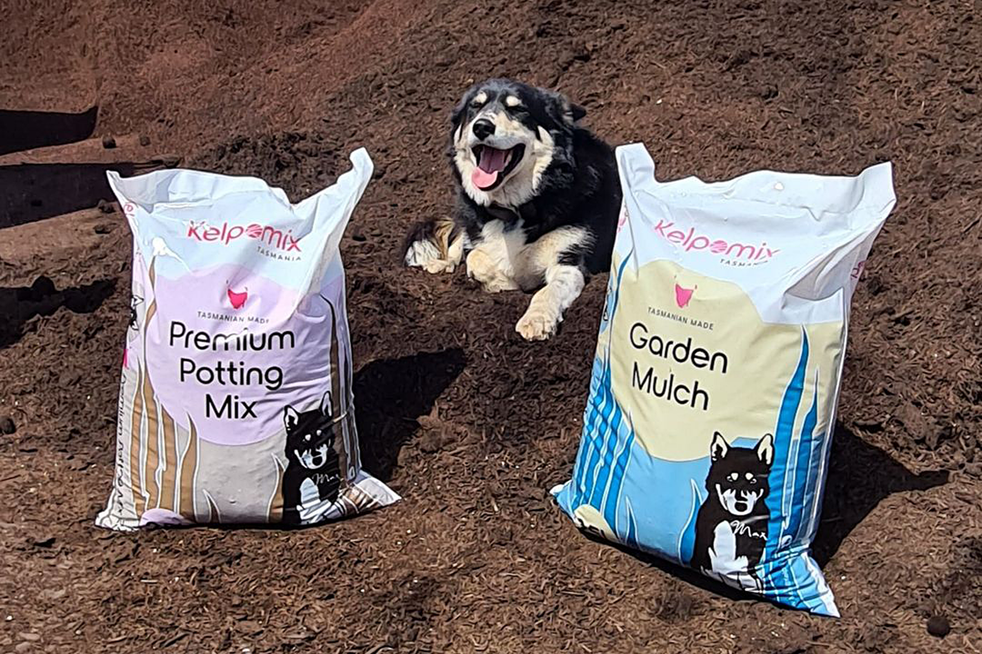 Kelpomix Tasmania
 - Rhuby InnovationsApril 11, 2019
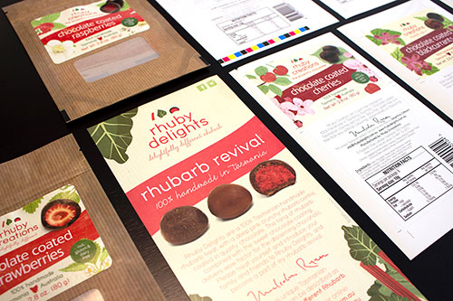 Rhuby Innovations
 - Cake a HikeJanuary 11, 2019
 Cake a Hike
 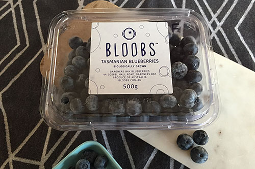 Gardners Bay Blueberries “Bloobs”
- Love Your Guts CoDecember 10, 2017
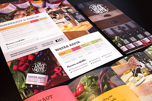 Love Your Guts Co
 - Church Hill BreweryNovember 11, 2017
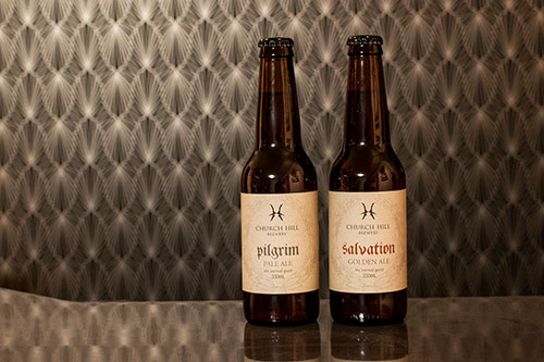 Church Hill Brewery